 Jen HoldenLicense ID: 639966
- +1(443) 803-7620 jen@thejenholdengroup.com
Design Forecast 2026
Design Forecast 2026
The Colors, Textures, and Finish Details Shaping What “Next” Looks Like
If you caught our “Design Forecast ’26” Instagram carousel, this is the deeper dive. Same ideas, more context, and practical ways to use the trends in real homes.
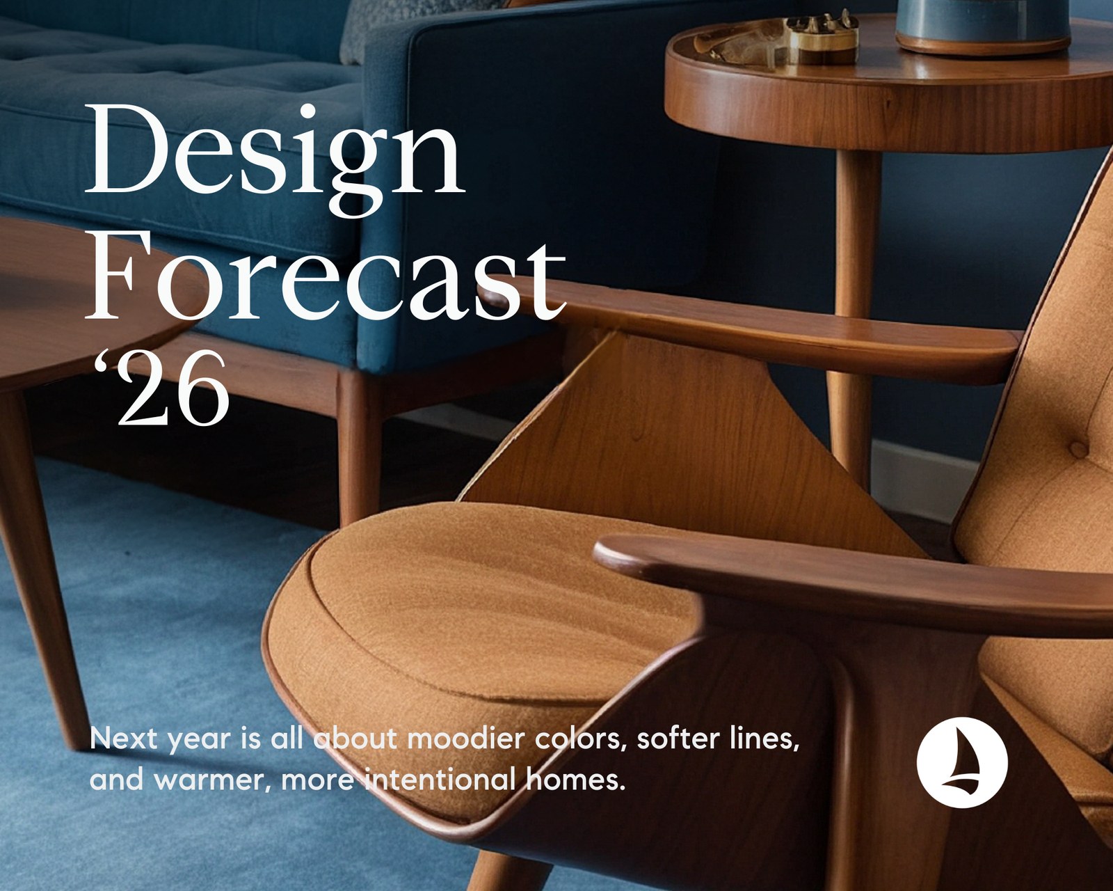
Quick takeaway: The most consistent theme across 2026 trend forecasts is depth. Richer color, layered texture, and handcrafted finishes are replacing flat, one-note neutrals.
Every year brings a new mix of “in” and “out,” but the most interesting shifts are usually bigger than one paint color or one sofa shape. Heading into 2026, multiple trend forecasts are aligning around the same core idea: homes are moving toward more warmth, more personality, and more intentional choices.
That does not mean everyone is going full maximalist. It means we are seeing more spaces that feel collected, layered, and lived in, with richer color, tactile materials, and details that feel made (not mass-produced).
At a glance: 2026 design is about depth
Color with mood
Dusty jewel tones and rich mid-tones replace flat neutrals
Immersive rooms
Color drenching and tone-on-tone schemes feel cozy and elevated
Layering on purpose
Patterns and textures are mixed to feel personal, not matchy
Handcrafted surfaces
Tile, plaster, limewash, and tactile finishes add character
Softer lines
Curves and organic forms keep spaces comfortable and approachable
Lighting as jewelry
Sculptural fixtures and warmer glow set the tone
Jump to:
Jewel tones | Color drenching | Pattern + texture | Tile moments | Tactile walls | Soft curves | Sculptural lighting
Trend Gallery
Click a trend to jump to that section.


1) Dusty jewel tones and rich mid-tones are warming everything up
The vibe: moody color that still feels calm and livable.
Instead of icy grays and one-note neutrals, 2026 is leaning into color that feels softened with time. Think: inky teal, smoked emerald, plum, burgundy, clay, chocolate brown, and warmer, earthier neutrals.
Why it works: these tones add depth immediately. They also pair beautifully with natural materials like wood, linen, stone, and aged metals.
Try it like this
- Start with a smaller space: powder room, office, hallway, or a cozy den
- Use “dusty” versions of saturated colors for a calmer, more timeless feel
- Balance darker paint with warm lighting, textured textiles, and lighter artwork
2) Color drenching is still trending, and it is getting more sophisticated
The vibe: cozy, cocooned, and intentionally monochrome.
Color drenching (also called tone-on-tone) means painting multiple surfaces in the same hue, often including walls, trim, and even ceilings. The result is a cocooned, cohesive room that feels intentional and design-forward.
The elevated 2026 version: mixing finishes and textures so monochrome does not feel flat. Matte paint with a grasscloth wall covering, a woven shade, or a velvet accent keeps the look dimensional.
Try it like this
- If full drenching feels like too much, do a “half step”: a built-in, niche, or alcove in a bolder hue.
- Keep one or two materials consistent (example: warm oak + aged brass) so the room feels grounded.
- Test paint in morning, afternoon, and evening lighting before committing
3) “Mismatched, on purpose” layering is replacing perfectly coordinated rooms
The vibe: collected and personal, not overly coordinated.
For years, the most common formula was “match everything.” In 2026, the shift is toward rooms that look collected over time. That might mean mixed patterns, varied textures, vintage accents, and contrasting materials, all working together because they share a common thread.
The key: cohesion comes from repeating a few elements, not matching everything. Repeat a color family, a metal finish, or a wood tone, then let the patterns and textures add personality.
Try it like this
- Pick a simple base palette (3 to 4 colors), then layer patterns inside that palette
- Mix pattern scale: one large print, one small print, one solid texture
- Use texture as a “pattern substitute”: bouclé, linen, wool, or woven materials
4) Tiles are getting more expressive (and more boutique)
The vibe: handcrafted surfaces that add character fast.
Tile is moving beyond basic subway and predictable layouts. The trend direction is toward personality: hand-painted looks, textile-inspired patterns, monochromatic statements, mixed materials, and finishes that celebrate craftsmanship.
Where it shows up: backsplashes, fireplace surrounds, bathroom feature walls, and even small moments like a coffee bar niche.
Try it like this
- Use a statement tile in one area and keep everything else quieter
- Go monochrome (tile and grout in a similar tone) for a bold but clean look
- Mix materials thoughtfully (example: stone + ceramic) for a layered, custom feel
5) Tactile walls and touchable finishes are becoming the new “luxury”
The vibe: texture that feels elevated but not fussy.
Glossy, overly perfect rooms are giving way to surfaces you can feel. That includes limewash, plaster, textured wall treatments, and soft textiles that add warmth without clutter.
One of the most interesting signals is how much trend reporting is focusing on texture, not just color. Washed linen, for example, is being called out as a defining texture direction for 2026, reflecting a preference for comfort and natural variation.
Try it like this
- Use limewash or plaster-inspired paint in a bedroom, dining room, or entry for subtle movement.
- Add linen curtains, bedding, or a relaxed-upholstery piece for instant softness.
- Choose “one hero texture” per room and let it shine (instead of adding too many competing finishes)
6) Softer lines are here to stay (curves, organic shapes, and warmer woods)
The vibe: comfort-forward shapes that soften a room instantly.
In 2026, comfort and approachability are driving form. Curved silhouettes, rounded edges, and organic shapes are continuing to replace sharp, overly rigid lines. Alongside that, warmer woods and tactile materials are increasingly appearing in furniture and decor.
Why it works: curves soften a space visually and physically. Warm woods and natural materials make color feel richer and more inviting.
Try it like this
- Swap one hard-edged piece for a softer one: an oval coffee table, rounded mirror, or curved chair
- Bring in a warm wood tone (even small pieces like stools or side tables)
- Use texture to amplify comfort: woven, nubby, or matte finishes
7) Lighting is getting sculptural, warmer, and more custom
The vibe: lighting that sets the mood and reads like design.
Lighting trends for 2026 are treating fixtures like functional sculpture. Expect more organic silhouettes, mixed materials, softer glow, and statement pieces that create atmosphere. In other words: lighting is not an afterthought anymore.
Try it like this
- Layer your lighting: overhead + table/floor lamps + accent lighting
- Choose warmer bulbs for a cozier, more flattering feel
- Use one standout pendant or sconce as the “jewelry” of the room
How to use 2026 trends without overdoing it
Trends should feel like inspiration, not homework. A smart approach is to pick one “big” move and two “small” moves:
- One big move: paint (dusty jewel tone or tone-on-tone)
- One texture move: linen, plaster, limewash, woven shades, or a tactile rug
- One detail move: tile moment, upgraded hardware, or a sculptural light fixture
Rule of thumb: Keep bigger choices (paint and surfaces) in calmer tones, then let personality show up in lighting, textiles, art, and decor.
FAQ
What is color drenching?
Color drenching is painting walls, trim, and sometimes the ceiling in the same hue to create a cohesive, cocooned look. It feels especially elevated when you mix finishes and textures.
How do I mix patterns without making it feel busy?
Stick to one color family, mix pattern scale (one big, one small), and add a solid texture. Repeating one metal or wood tone also helps everything feel connected.
What is the simplest update that makes a big impact?
Paint and lighting. One intentional color choice and warmer, layered lighting can transform a space faster than most people expect.
Thinking about a move, a refresh, or just saving inspiration?
These trends apply whether you are buying, selling, staying put, or simply gathering ideas. The common thread is creating spaces with warmth and depth, using color, texture, and craftsmanship in a way that feels authentic to how you live.
If you want help translating “trend” into a realistic plan for your home (and your budget), we are always happy to be a resource.
Sources and further reading
- Architectural Digest AD PRO: 2026 Interior Design Forecast
- Martha Stewart: 5 Paint Trends That Will Transform Homes in 2026
- Martha Stewart: Interior Design Trends to Know for 2026
- 1stDibs: Guide to 2026 Designer Trends
- 1stDibs Survey (via Business Wire): 2026 Interior Design Trends
- Vogue: The Key Interior Design Trends Set to Define 2026
- Etsy: 2026 Color of the Year and first-ever Texture of the Year
- The Spruce: Kitchen Tile Trends for 2026
- The Spruce: Furniture Trends for 2026
- Homes & Gardens: Lighting trends predicted for 2026
Categories
Recent Posts